> Data science course by AMA & ICAML - Practical Part
Analyzing dependencies
# Imports
import seaborn as sns
import matplotlib.pyplot as plt
import pandas as pd  # pandas renamed to pd

# read cleaned dataset
table = pd.read_csv('titanic_cleaned.csv', sep=';')
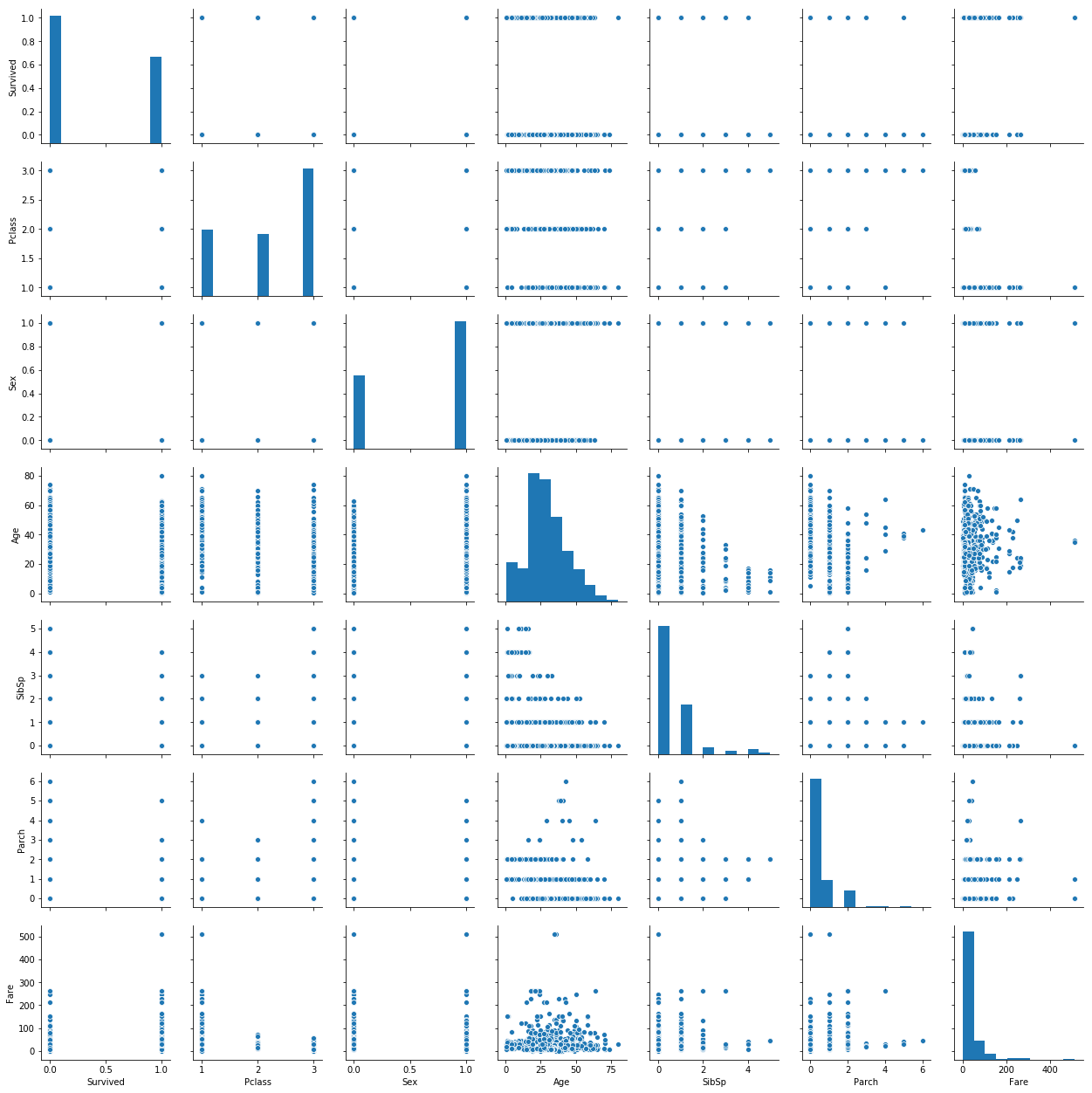
We want to find out how variables relate to eachother. The pairplot method is a convenient way of comparing distributions of variables.
sns.pairplot(table)
<seaborn.axisgrid.PairGrid at 0x7fac996d9d68>
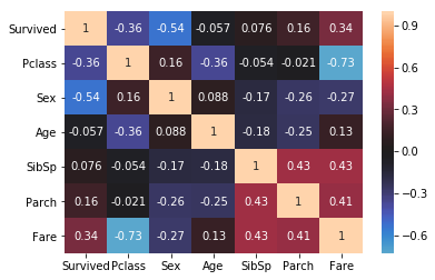
We can explicitly check for the directionality and strength of relationships by computing correlations. Pandas offers a corr method to that end, which we can visualize as a heatmap.
corr_matrix = table.corr(method="spearman")
sns.heatmap(
  corr_matrix,
  center=0,
  annot=True)
<matplotlib.axes._subplots.AxesSubplot at 0x7fac961ab828>
Es fehlt noch die kategorische Größe ‘Embarked’. Um uns auch einen schnellen Eindruck über mögliche Zusammenhänge dieser Variablen zu verschaffen, transformieren wir sie per one-hot encoding (1-aus-n Code).
table['embarked_s']=(table['Embarked']=='S').astype(int)
table['embarked_c']=(table['Embarked']=='C').astype(int)
table['embarked_q']=(table['Embarked']=='Q').astype(int)
table[['Embarked', 'embarked_s', 'embarked_c', 'embarked_q']].head()
| Embarked | embarked_s | embarked_c | embarked_q | |
|---|---|---|---|---|
| 0 | S | 1 | 0 | 0 |
| 1 | C | 0 | 1 | 0 |
| 2 | S | 1 | 0 | 0 |
| 3 | S | 1 | 0 | 0 |
| 4 | S | 1 | 0 | 0 |
corr_matrix = table.corr(method="pearson")
plt.figure(figsize=(10, 8))
sns.heatmap(
  corr_matrix,
  center=0,
  annot=True)
<matplotlib.axes._subplots.AxesSubplot at 0x7fac8bd63400>
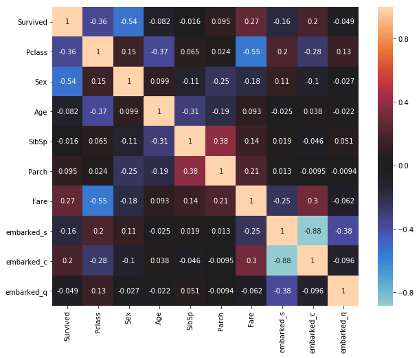
Damit berechnen wir für (ggf. so erstelte) dichotome Variablen effektiv eine Punktbiseriale Korrelation (point-biserial correlation).
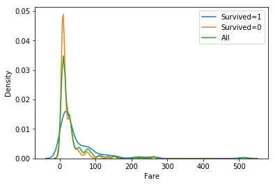
Now we want to compare (visually) the distributions for possibly important variables for the ‘Survived’ outcome. ‘Fare’ has a high correlation to ‘Survived’, so we use Seaborn’s kdeplot method to compare the distributions, or rather their density estimates.
g=sns.kdeplot(table[table["Survived"]==1]["Fare"], label="Survived=1")
sns.kdeplot(table[table["Survived"]==0]["Fare"], label="Survived=0")
sns.kdeplot(table["Fare"], label="All")
g.set(ylabel='Density', xlabel="Fare")
plt.legend(loc="best")
<matplotlib.legend.Legend at 0x7fac8ba72d30>
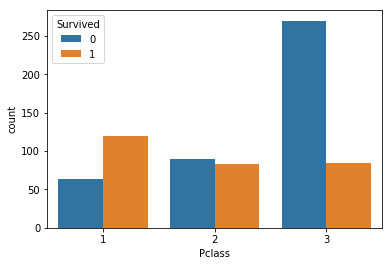
Exercise:
Explore the differences in other variables.
Hint: to compare categorical variables, the countplot is a useful visualization method. We can pass a column name (‘Survived’) to the hue parameter to split up the data.
### BEGIN SOLUTION
sns.countplot(x="Pclass", hue="Survived", data=table)
### END SOLUTION
<matplotlib.axes._subplots.AxesSubplot at 0x7fac8bc9f240>
# Data Analysis At this point we identified possibly important variables related to the survival of passangers and inspected them visually. Before we engage in predictive modelling — either for the purpose of generating forecasts or as a means of testing further for meaningful patterns in the data — we want to analyze the patterns statistically.
To this end, we want to assess whether the differences we identified for passengers who survived and those who did not are statistically siginificant, i.e. is the probability of observing these differences by random chance sufficiently low, for us to assume that the differences are actually meaningful.
import scipy
import numpy as np
# function to calculate Cohen's d for independent samples taken from https://machinelearningmastery.com/effect-size-measures-in-python/
def cohend(d1, d2):
    # calculate the size of samples
    n1, n2 = len(d1), len(d2)
    # calculate the variance of the samples
    s1, s2 = np.var(d1, ddof=1), np.var(d2, ddof=1)
    # calculate the pooled standard deviation
    s = np.sqrt(((n1 - 1) * s1 + (n2 - 1) * s2) / (n1 + n2 - 2))
    # calculate the means of the samples
    u1, u2 = np.mean(d1), np.mean(d2)
    # calculate the effect size
    return (u1 - u2) / s
Hypothesis tests
In the following, we will compare data for survivors and nonsurvivors. To this end, we split up the data, for easier handling.
survived_false = table[table.Survived == 0]
survived_true = table[table.Survived == 1]
Visually, we found a difference in the distributions of fare for suvivors and non-survivors. For this numeric variable, before applying any parametric tests (e.g. t-test) we would like to find out whether the data is normally distributed. To this end, scipy offers the method normaltest. We are interested in whether the p-value is below an acceptable threshold (e.g. 0.01) for both of the distributions.
k2, p = scipy.stats.normaltest(survived_false.Fare)
p
1.442947570282371e-92
k2, p = scipy.stats.normaltest(survived_true.Fare)
p
2.5035944341930116e-56
The data appear to be normally distributed. Hence we can apply the independent samples t-test to reason about the differences in the mean fares.
In addition, we use the ``cohend’’ function defined above to calculate the effect size — a measure that relates the observed differences in means to the variation found in the data.
t, p = scipy.stats.ttest_ind(survived_true.Fare, survived_false.Fare)

print("t={:.3f}\np={}\nd={:.3f}\n".format(t, p, cohend(survived_true.Fare, survived_false.Fare)))

print("mean fare survivors:{:.3f}".format(survived_true.Fare.mean()))
print("mean fare non-survivors:{:.3f}".format(survived_false.Fare.mean()))
t=7.356
p=5.256795780683418e-13
d=0.562

mean fare survivors:51.648
mean fare non-survivors:22.965
The difference in the mean fares is indeed significant and the effect size is medium.
Next, there was a correlation observed between the sex of the passangers and their survival. Let us check the distributions first:
survived_true.Sex.value_counts(normalize=True)
0    0.677083
1    0.322917
Name: Sex, dtype: float64
survived_false.Sex.value_counts(normalize=True)
1    0.849057
0    0.150943
Name: Sex, dtype: float64
The variable is categorical this time, so we will employ a chi-square test to test for differences in the distributions between survivors and non-survivors. For this, we first need to construct a contingency table:
ctable = pd.crosstab(table['Sex'], table['Survived'])
ctable
| Survived | 0 | 1 |
|---|---|---|
| Sex | ||
| 0 | 64 | 195 |
| 1 | 360 | 93 |
Now we cann call the chi2_contingency method, which provides us, among others, with the chi2 value (test statistic), a p-value and the degrees of freedom. Again, we will calculate a measure of effect size. Here we use the Cramer’s V for the effect size.
chi2, p, dof, ex = scipy.stats.chi2_contingency(ctable)
print("chi2={:.3f}\np={}\n".format(chi2, p))
# Cramer's V
r, k = ctable.shape
V = np.sqrt(chi2/(ctable.sum().sum() * min(k-1, r-1)))
print("V={:.3}".format(V))
chi2=202.869
p=4.939416685451492e-46

V=0.534
Exercise:
Check for the differences in another promising variable.
### BEGIN SOLUTION
ctable = pd.crosstab(table['Pclass'], table['Survived'])
ctable

chi2, p, dof, ex = scipy.stats.chi2_contingency(ctable)
print("chi2={:.3f}\np={}\n".format(chi2, p))
# Cramer's V
r, k = ctable.shape
V = np.sqrt(chi2/(ctable.sum().sum() * min(k-1, r-1)))
print("V={:.3}".format(V))
### END SOLUTION
chi2=91.081
p=1.6675060315554636e-20

V=0.358
| Author: | Markus Rokicki, Dennis Wittich |
| Last modified: | 15.10.2019 |